Packaging, Redesign, Layout
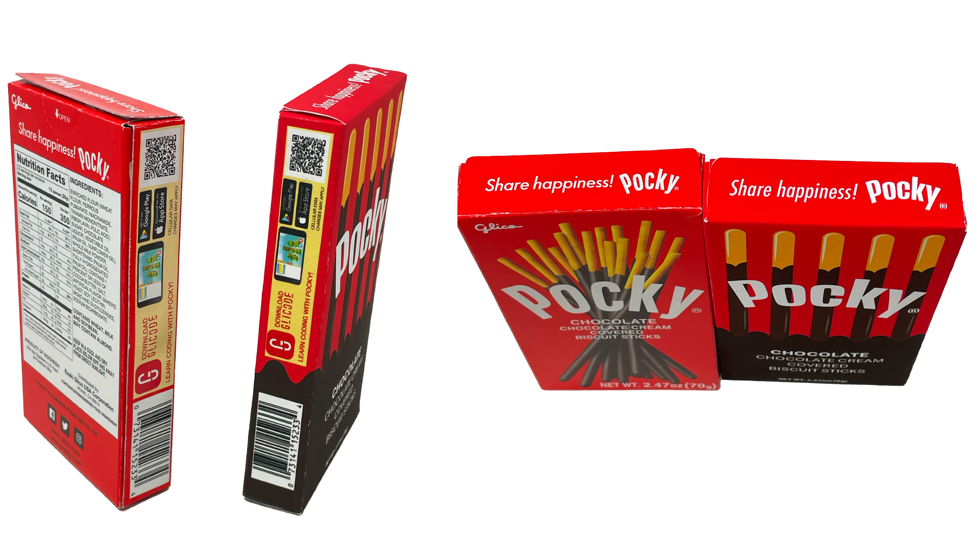
For a school project focused on packaging design, I was assigned the task of redesigning the box for Pocky, the iconic Japanese snack known for its biscuit sticks coated in various flavors. The assignment required us to construct the packaging by hand and make a significant change to differentiate it from the original design. My approach was to reimagine the familiar photorealistic presentation of Pocky, opting instead for a vector illustration style that emphasizes bold colors, clean lines, and playful graphics. The redesign retains the essence of the snack while giving it a fresh, modern twist that stands out on shelves. This creative direction aimed to capture a younger, design-savvy audience while maintaining the approachable and fun brand identity Pocky is known for. The process involved conceptualizing a new visual language, selecting a color palette that complemented the flavor theme, and ensuring the layout adhered to functional packaging standards. This project was an exploration of how visual design can transform a product’s appeal while staying true to its brand essence.